We have new branding: a new logo, a new colour scheme and a new strapline at the Association of Chairs. Why? What was wrong with the old ones?
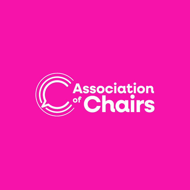
Our new logo
Our old logo was great for the era in which we were started. But several things have happened in recent years. Our old logo depicts a traditional hierarchical board in which everybody sits around a table, and the chair is the lead figure.
This visual is no longer reflective of many charity and non-profit boards. They are less hierarchical, and the chair needs to be facilitating and encouraging, as well as being the lead. Another change was the pandemic: boards meet more and more on video calls now.
Our new logo tries to show our role in speaking out, and in communicating the work of chairs and boards. It also tries to show the multiple levels in which chairs and boards work with the concentric and interconnected circles, and reflects our role in helping chairs to communicate and connect with each other.
Our own members helped us to choose the design – voting in a poll on our busy chair’s WhatsApp group – and it was great to have their input.
Our new colour scheme
As important as our new logo is our new colour scheme. We wanted something which was brighter, more vibrant and more likely to stand out in a crowded marketplace. The new colour suite is an exhilarating mix of pink, burgundy, teal and sky blue that will hopefully help us to stand out on social media. They also indicate the diversity and breadth of our work, our members, and the non-profits they service. We want people to sit up and take notice of us!
Our new strapline
Our new strapline – effective chair, effective board, effective non-profit – punches through with the messages of our beliefs. It aims to highlight the inter-relationship between the effectiveness of the chair and their board, and also the inter-relationship between the effectiveness of the board and the organisation.
Let me be blunter. A chair’s effectiveness is limited or enhanced by the effectiveness of the rest of the board. The effectiveness of any non-profit is limited or enhanced by the effectiveness of its chair and its board.
That “ripple effect” is reflected in the new logo’s concentric circles too. The impact of an effective chair, an effective board, an effective non-profit is far wider than the organisation itself – the impacts are felt by service users and communities locally, nationally, or internationally, depending on who and where the organisation serves.
New strategy, new branding
Our new strategy talks about how we increasingly need and want to support leaders on the board as well as the chair: to spread the workload, improve succession, and increase the levels of skill and expertise on the board. Our new strapline is us wearing our beliefs on our sleeve. And if it arrests you with the clarity of its message and the boldness of our conviction, then it is doing its job.
We are a tiny organisation in the face of the number of charities and other non-profit organisations in the UK. We have to punch above our weight given our size and the scale of need. If our new logo, visual brand and strapline help us communicate our work and reach more chairs and boards then it will be a vital part of our communications toolkit. We worked with Ave for our new branding.
I look forward to hearing what you think on [email protected]